The Ticwatch Pro 3 is a great productivity enhancement tool while the Suunto 7 is a fantastic sports companion.
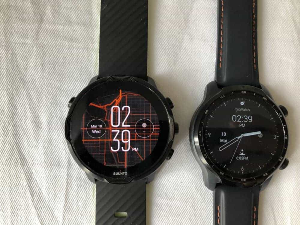
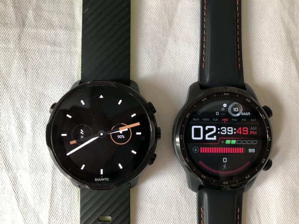
You’d never think the 7 is a more expensive smartwatch than the 3 by just taking a look at it.
But then again, we shouldn’t judge the based on its cover.
But why does the 7 not feel like a premium smartwatch?
In my opinion, it’s because it’s very “artificial.” What I mean by that is that it really has much more plastic and rubbery surfaces as compared to the 3 GPS. It’s also bigger and has five buttons which go against the trend of miniaturization. If we look at Apple iPhones, they’ve been getting rid of buttons over time and that can be a cue that having many buttons isn’t in vogue.
The 3 looks a lot more modern with its leather strap and red stitching. Its all-black surface also makes it look very elegant and lastly, it’s a lot slimmer.
But let’s go beyond judging these watches by their covers.
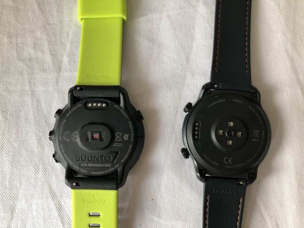
Hardware
OK, so hardware is pretty important because it gives you an idea of how well it would perform.
I am happy to say that both smartwatches are really speedy.
Every time I receive a , the first thing I look out for is the hardware because it would determine my experience with the . If you see any smartwatch with the Wear 2100 or 512MB of RAM, you should be aware that there will be instances of lag.
Luckily, the Suunto 7 comes with the Qualcomm Snapdragon Wear 4100, which is the latest and fastest processor available for Wear OS smartwatches. This is great because it’s even better than the 7’s Wear 3100.
Both have so that means you’re able to get things done quite smoothly. There’s no lag on the 7 and therefore, even less so on the 3. This is most obvious when you summon Google Assistant. On lesser systems, Google Assistant can take a while before it’s ready to take your query.
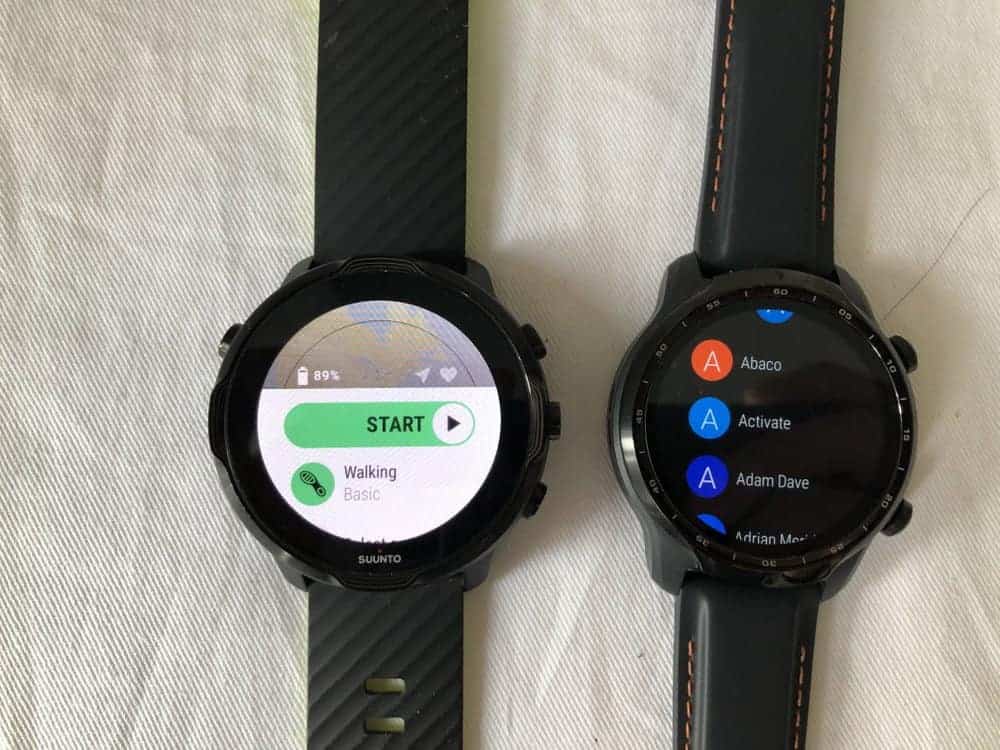
The Wear OS experience
The Wear OS is a great operating system that has seen many improvements over the last year.
What I like about the operating system that powers both smartwatches is that the Wear OS offers a dynamism that’s not available on other smartwatches’ OS, except Apple’s WatchOS.
The Google Play Store is large and you can find many apps on there. What I really like is Google Maps, Google Keep and Google Translate. They are really convenient to have.
Another great thing about the Wear OS is that you can use Google Assistant. I think having Google Assistant on your smartwatch is very convenient because you no longer have to keep your phone nearby in order to ask Google to start a timer or check the weather. What I like to do is to set a timer for laundry and after 40 minutes (and me forgetting I am doing laundry), the will vibrate and remind me to go pick up the laundry. Really helpful, especially if you’re the type to leave your smartphone far away from yourself.
Messaging
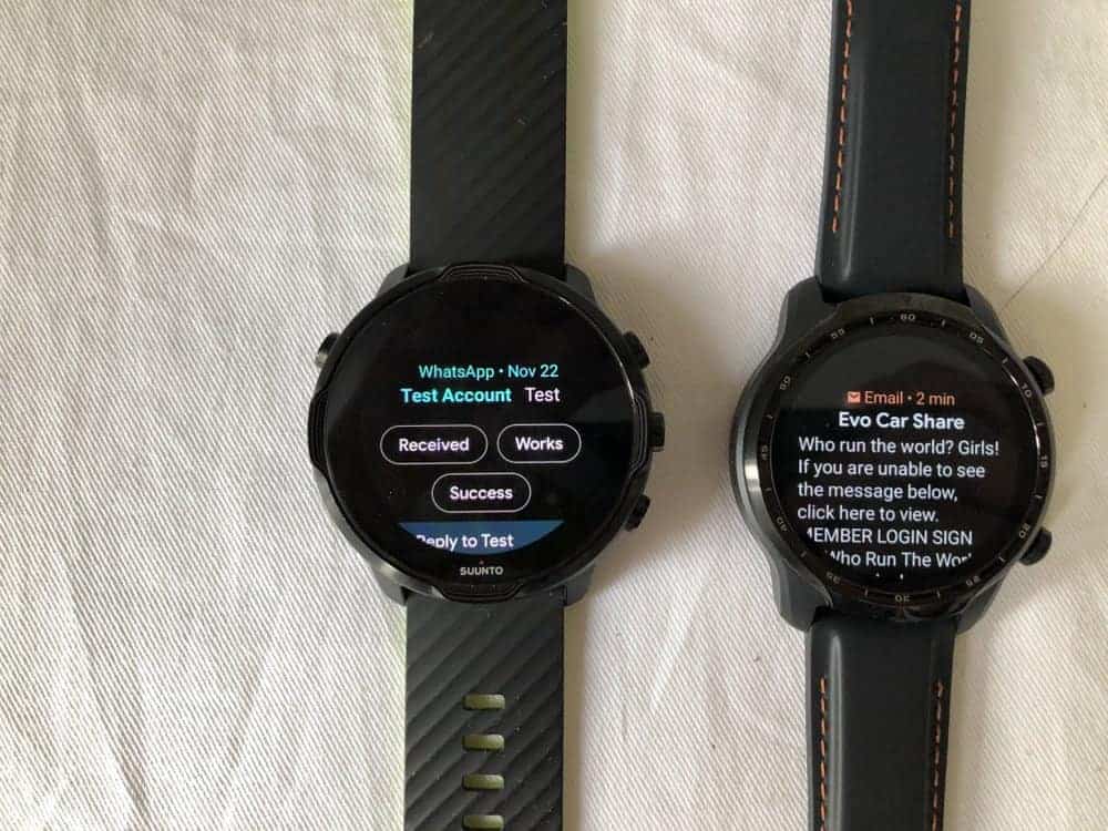
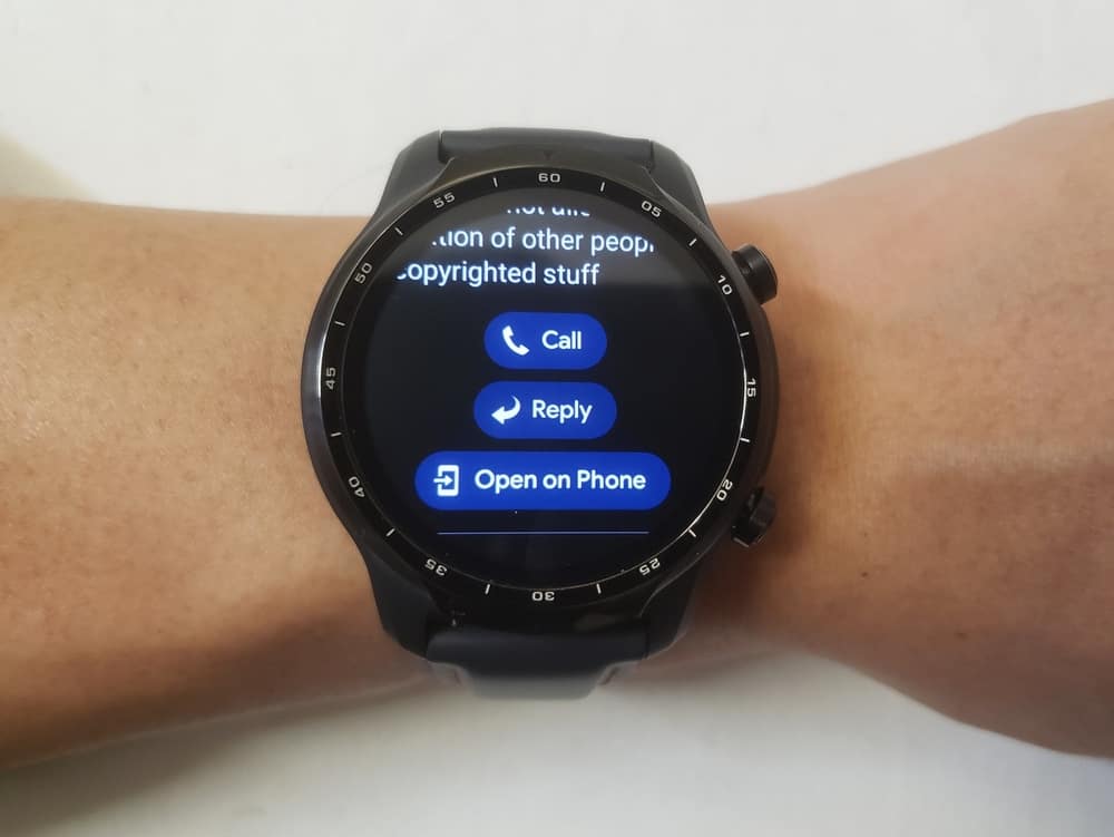
The other aspect which I like about the Wear OS is the ability to reply to messages reliably.
This really helps you when you are out and about and find it inconvenient to reach for your smartphone, such as when you are exercising and need to quickly reply to a message.
Granted, this is only possible if you are paired to an Android smartphone.
So, when a message or email comes in, you are able to read a snippet of it. For messages, it’s mostly enough but for emails, the snippet can be a little too short. Nonetheless, if you do decide to reply to those messages, you can either used a canned response or you can reply using the speech to text system.
The speech to text system is very accurate and very intelligent. It knows where to put punctuation which is amazing. It’s hard to appreciate how good the system is until you’re stuck with dealing with a lesser system which gets it wrong half the time. Then you’ll just stew in the frustration of having to deal with re-creating the message again. Luckily, this doesn’t happen often with the Wear OS.
Note: you can also reply using the keyboard or handwriting function but those are super tedious and I usually just go straight to my phone.
Calls
Here’s a point of difference between the 3 and the 7.
The 7 doesn’t have a speaker. It has a buzzer that goes beep.
The 3 has a speaker and it unlocks its ability to make phone calls.
I think it’s pretty important because what has traditionally separated an entry-level with a premium counterpart is the ability to receive and make phone calls. But this doesn’t stand true for the 7.
Whereas, on the 3, you can make calls and receive calls which therefore fits my idea of a “premium” . The sound quality is just OK. It’s not something you want to use for serious phone calls. It’s convenient, though, to be able to answer a call immediately when your phone is nowhere to be found.
Revisiting buttons
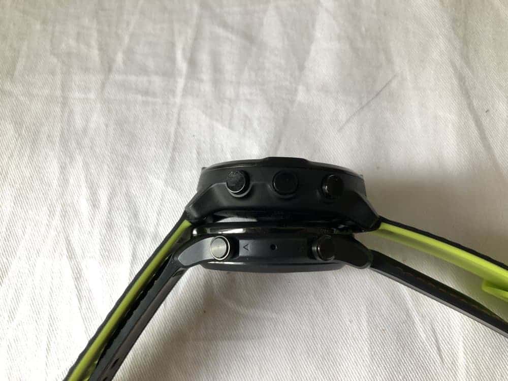
I might have thrown shade at the number of buttons on the 7 but I’d say it’s only unpleasant from an aesthetic perspective.
Having five buttons really makes things very convenient. For example, when you are out exercising, the last thing you want to do is to use touch gestures to activate some functionality. With the five buttons on the 7, you can change screens, play music, skip tracks and other tasks without having to look at your screen. The tactic feeling of pressing a button is very useful when you can’t look at your screen but you want something to happen.
No such luck on the 3, though. Its two buttons offer some convenience but because one button is always reserved as the home button, the other button’s functionality is always limited to less granular actions.
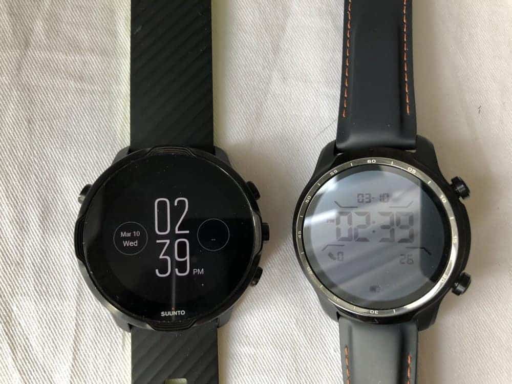
The of the 3 is one of the most amazing out there. For a that’s meant to be worn 24/7 (for ), the 3 lasts almost as long as a smartwatch, which is amazing.
What really helps the 3 have such legendary is its new, power-sipping processor and also its dual screen. A monochrome LCD is layered on top of the full colour LED screen. The latter is turned off for as long as possible to conserve .
There’s no such fanciness with any other smartwatch, including the 7.
Sports and health
One big difference between the 7 and the 3 is the proprietary apps they come with.
The 7 comes with the which is a powerhouse of exercise logging. You also get .
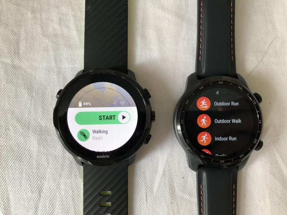
The ‘s has many choices of exercises that you can track and after each workout, you’ll be offered analysis that speak to the intensity of the workout and how much recovery time should factor in.
Whereas the 3 comes with its Tic-something suite of apps. So, TicExercise to track workouts, TicZen to track stress and TicHearing to track noise levels.
Comparatively, TicExercise has very few workouts that you can pick from, which is why you’ll see me cycling on water in some of my workout logs.
The 3 is also able to track SpO2 levels, which is bloody oxygen levels. It’s very much in vogue these days to track this metric but I honestly don’t know how useful it is. The 7 can’t.
Both smartwatches are suitable to be taken swimming, so that’s good.
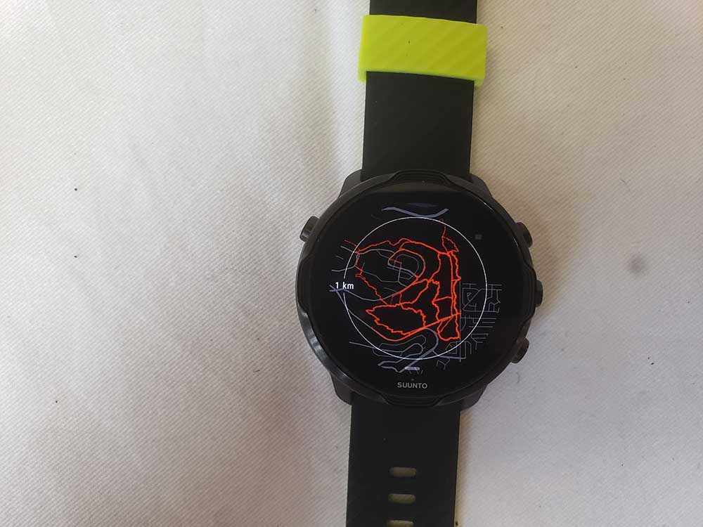
The most important that really separates the 7 with the 3 is its inclusion of . I think this really makes the biggest difference if you are an outdoors enthusiast.
Imagine if you are deep in the woods and need to find a way through the woods. Or if you are out in the open ocean and need to find your way back. These scenarios are some of which I find it really useful to have an offline map which will always be available, conveniently on your wrist, and doesn’t depend on a data connection.
I think this is very much worth it.
Verdict
The main difference between the two smartwatches is the market they’re aimed at.
You’d buy the 7 if you are looking for a smartwatch that can help you improve on your performance.
You’d buy the 3 if you are looking for a smartwatch that primarily brings you convenience, but that’s not to say that the 7 lags behind the 3 a lot.
For most people, the Ticwatch Pro 3 offers the best bang for buck. But for the few outdoors and workout analysis enthusiasts, the 7 is amazing.


