Mega review of the Apple Watch S2 with 40 plus photos and screenshots as well as our 14 minute in-depth video overview. Learn all you need to know.
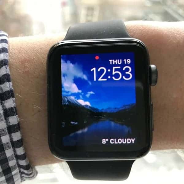
Just like the Apple S7 plus mobile phone, I’m hot and cold about the Apple S2 watch (in relation to other smartwatches on the market). There are some things I love about it such as the graphics, Siri accuracy, and the interface for many of the apps.
However, I’m not wild about the physical design. It looks too much like a gym watch; which is fine in the gym, but not really much of a stylish watch outside of the gym.
The Apple S2 is a “smartwatch” through-and-through. Its physical design contributed to traditional watch companies like Fossil and TAG Heuer jumping into the smartwatch market.
The geek in all of us, the S2 is fabulous. For the stylin’ us, not so much.
I’m coming across a bit extreme on both accounts and perhaps it should be a bit more nuanced. For instance, it’s not an ugly watch. Likewise, not every smart feature is best-in-class. It has weaknesses.
That’s where our lengthy review comes in… below we outline many aspects of this watch explaining what it is, what it does, what’s good about it, and what’s bad about it. We hope this review helps you choose the right smartwatch for your needs.
If you’re looking for specific info, jump ahead below via our quick navigation table.
Contents
What you get
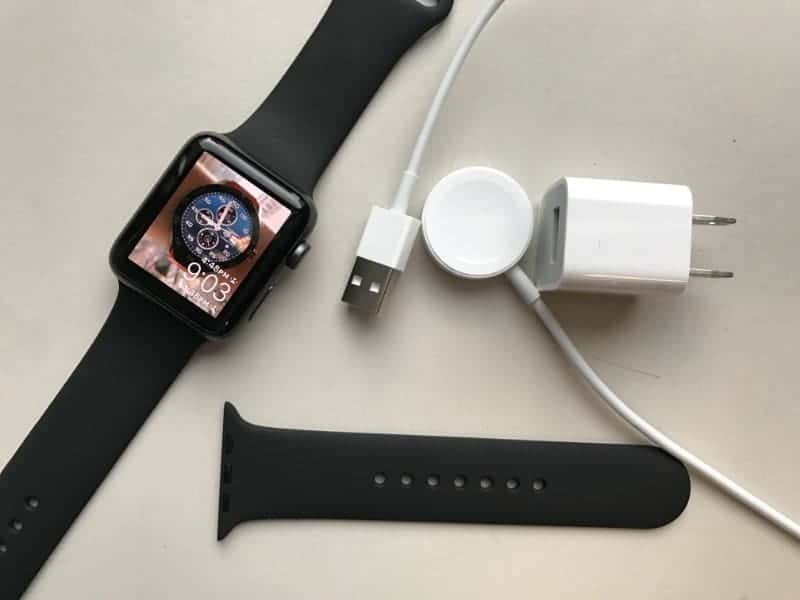
As with most Apple products, the packaging is lovely (for packaging). I guess Apple believes first impressions are important. It’s easy to access and all components are so nicely organized inside the box. It’s a pleasure to open.
You get the following:
- Watch (choose between 42 and 38 mm watch case sizes);
- The extra strap (the portion with the holes);
- Wall charger adapter; and
- USB port charger.
The quickstart instructions are amazing; the best set of instructions I’ve gone through of all the many smartwatches I’ve purchased.
Setting it Up
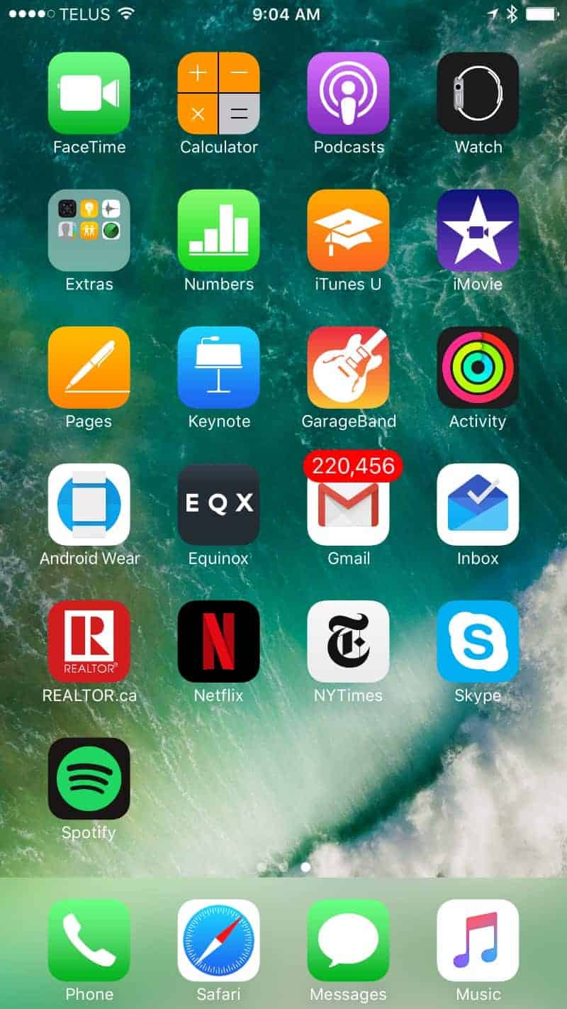
The Watch App is the one at top right:
Below is the main page of the Watch app:
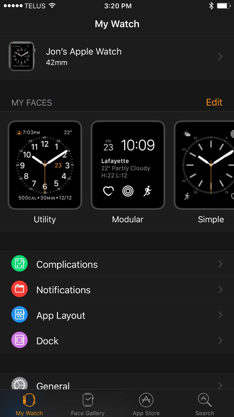
You know Apple wants you to buy a watch when upon getting a new iPhone, the watch app is already there just waiting for you to pair it with a watch.
While a little bit “hit you over the head” aggressive, I liked it because I didn’t have to waste time installing the watch app. It was there waiting for me.
Pairing it couldn’t be easier. I turned on the watch, chose language and country. I then opened the Watch app on my phone and once both app and phone suggested pairing, I tapped that button and it was done inside a minute or two.
Once paired, I spent about 90 minutes familiarizing myself with the watch app on my mobile device as well as checking out the apps on the watch. I added one app (tried to add several such as Spotify and Netflix which aren’t apps for the watch) and spent time configuring settings such as email.
I then spent a little time in the app store, which I suggest you access via the watch app so you access only apps available for the watch. I browsed various offerings, none of which interested me except the NY Times headlines app.
The final part of my setting up the watch was playing around with individual apps on the watch such as heart rate monitor (it’s very cool), email, messaging, maps, calendar, and Apple health. I also goofed around with managing everything via Siri voice recognition.
All-in-all, I spend 2 hours setting it up and playing around with it at which point I was fairly familiar with the main functions.
Wearing It (Comfort)
If you don’t like heavy, big watches, you’ll love this watch. It’s light, not terribly large and it doesn’t need to be too snug in order to stay put on your wrist. In fact, I can barely feel that I’m wearing a watch with this on.
That said, it does come with a rubber band (the model I got), which is typically more comfortable than leather and steel bands.
The rounded edge of the watch face is actually a super smartwatch design. This prevents shirt cuffs from getting stuck to the corner. Besides, for a smartwatch, it’s reasonably thin as well.
Design
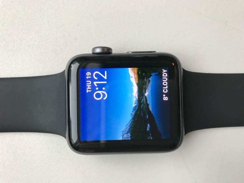
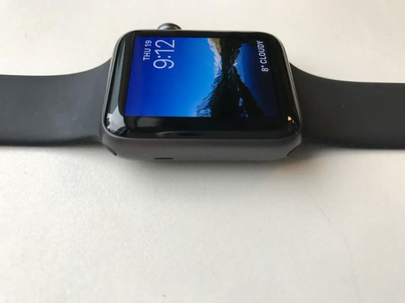

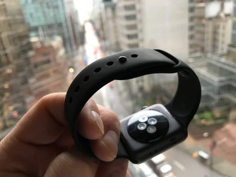
Physical Design
Square Design
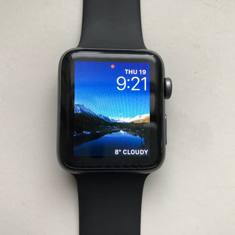
I can appreciate Apple not wanting to launch many models of its watch (often less is more), but I’m kinda surprised there isn’t a round version available.
I’m all about square/rectangular watches for the gym. In fact, they’re more comfortable, especially for working out. Call me old school, I prefer the design of round watch faces. Now, I know this is traditional, old school thinking because round watches came about to best accommodate a dial clock. But guess what, my favorite Apple face is the dial and it just doesn’t look as good on a square watch. Overall, I’m not big on digital watch faces; I prefer the dial except for working out.
The Buttons
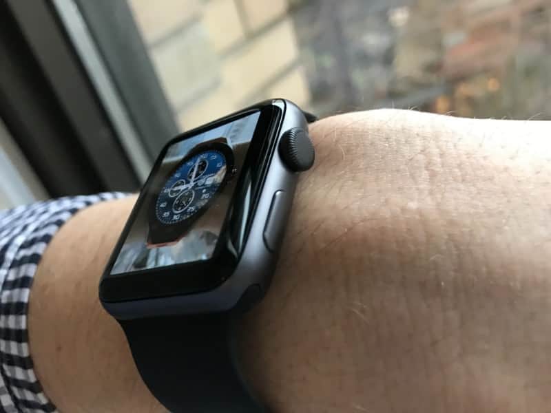
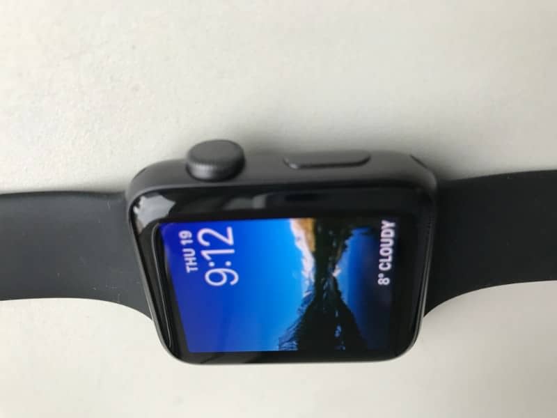
There are 2 buttons on the side. A large, round button and smaller oval button below it.
I get the large round button. It helps navigate and does a great job.
The fact you can scroll by turning the large round button is brilliant. I find it very useful for scrolling; often more convenient than swiping the screen. This is an excellent use of the larger button.
The lower, less pronounced button serves 3 functions. First, it takes you to the docking stage where you can remove apps from the docking area. The docking area is a set of apps you can access quickly via scrolling. It’s where you want to put your most-used apps.
Second, this button will access Apple pay.
Third, this button, when held in, will give you the option to turn the watch off and/or send an emergency SOS message.
The Glass/Screen
The graphics are amazingly crisp and bright. Much better than Android Wear smartwatches. It’s just too bad there aren’t nicer watch faces to take advantage of the superior graphics.
The glass/screen itself is practically smudge-proof compared to Android Wear smartwatches.
Overall Physical Design Impression
I’m not wild about the physical design. Yeah, it’s an Apple watch but I don’t want people to think it’s cool because it’s an Apple watch. I want it to be cool or beautiful or elegant or fabulous because it actually is.
I think it’s kind of a childish design. It’s great for the gym because it has the gym look, but it’s not such a great design for the office and going out. It looks like a video game watch which is not the look I usually like to have on my wrist.
Watch Interface Design
I love the watch interface design. The graphics are insanely crisp and navigating this watch is so easy. Swiping is spot on and gestures are super sensitive. When it comes to a smartwatch user interface, Apple is the watch to beat.
Watch Face Selection
The best to change, edit, and customize watch faces is in the Watch App in the Face Gallery section.
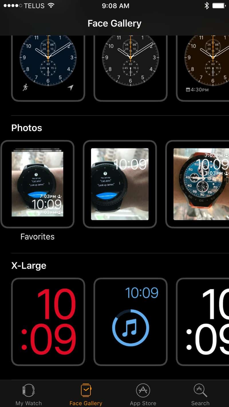
You can customize each watch face available… each face may be slightly different in its offerings.
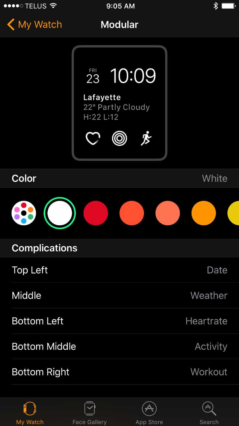
I’m disappointed with the variety of watch faces. While you can totally customize each watch face in the Watch App (on your Apple phone), the variety of base options is pretty limiting.
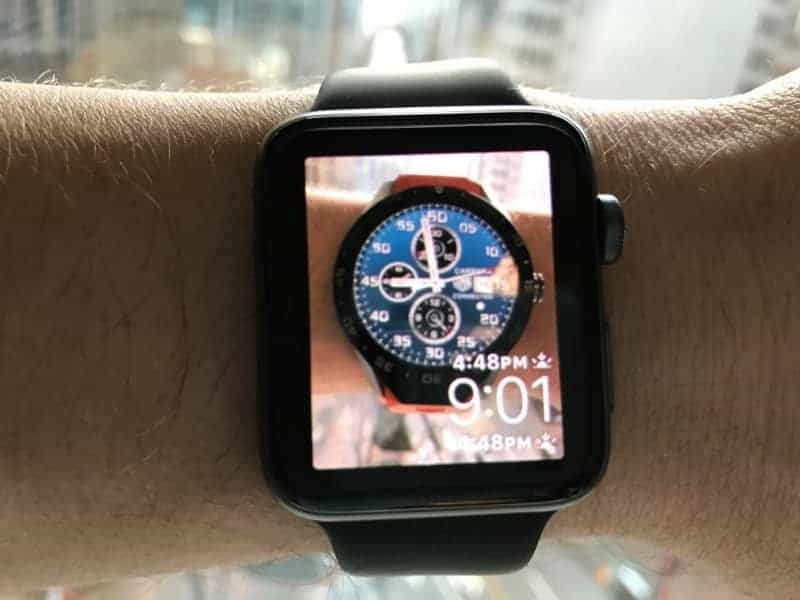
What I do like, however, is the option to assign photos as the watch face. This is a very cool feature that is also fun giving you the option to have a truly unique Apple watch (as far as the face is concerned).
I typically prefer dial style watch faces, but frankly, a dial watch face doesn’t look all that good on a rectangular shaped watch.
All-in-all, I’m luke-warm to the watch face selection, but the photo custom watch face option is fabulous. To solve my watch face selection problem, I could take a photo of my favorite watch face of all time (TAG Heuer’s blue Chronograph) and then use that photo as my Apple watch face.
Here’s my Apple Watch with the TAG Heuer watch face:
App Access (Navigation and User Experience):
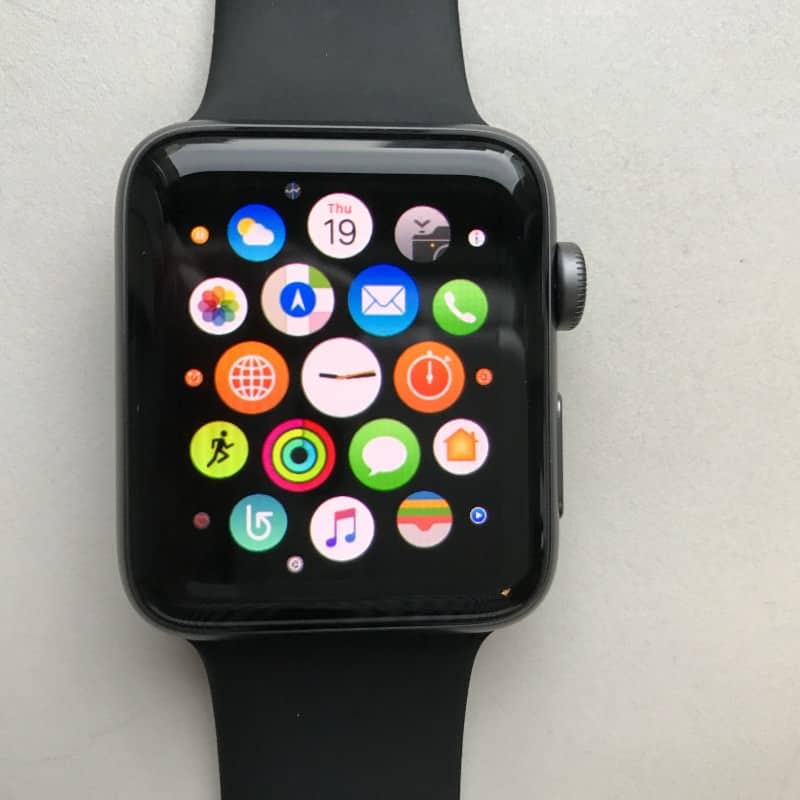
For example, you can access all apps one screen away from the home screen (i.e. clock), unlike Android Wear with which you endless scroll down. Even Samsung Gear S3 watches require jumping from screen to screen. App access and use on Apple is amazing.
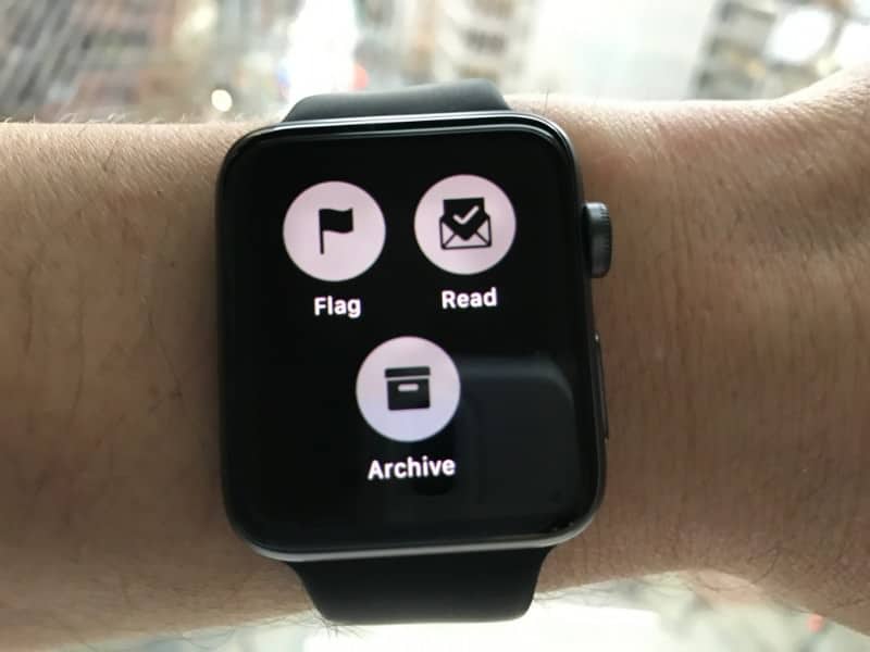
I also love how Apple incorporating pushing down on the screen for additional watch functions. For example, when in an email, in order to reply, you hold down on the screen and reply plus other options will be made available. By incorporating this functionality, the watch is able to do more without having to navigate more.
From the home/lock screen, just push the large round button and you’re taken to your apps.
App interface and performance:
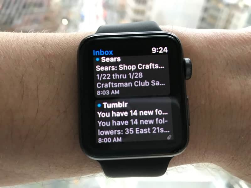
Again, Apple knocked it out of the park with most of the app interface/design/display on the phone. For instance, the emails are so easy to scroll through as well as read individual emails.
| Function | Details |
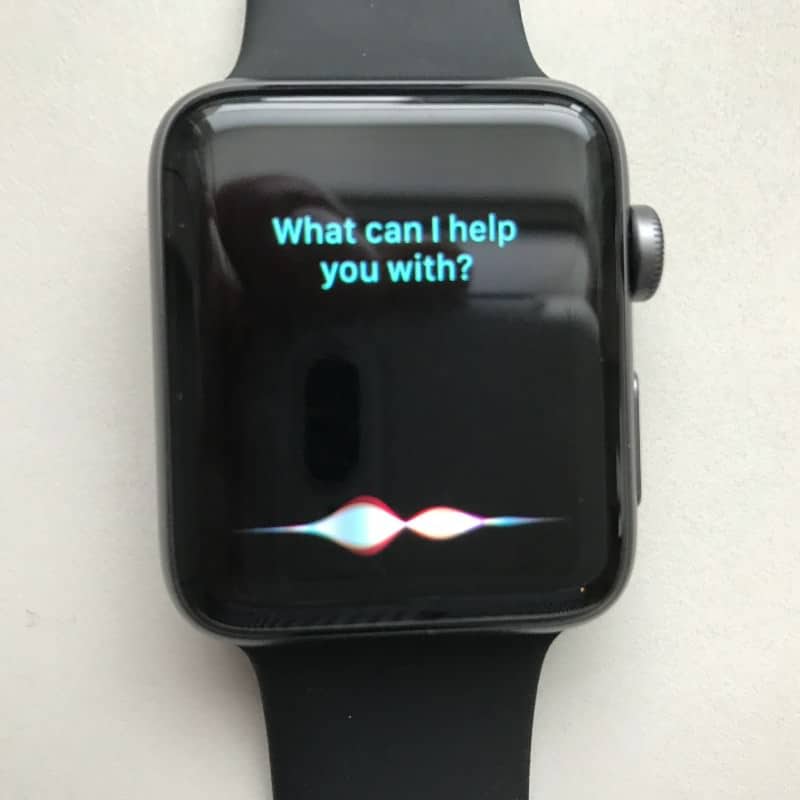
| Siri (Voice Recognition) | Very good accuracy although once you input voice instructions there’s a bit of a delay.
|
| Decent. I like the display and how you scroll through emails, but the actual display of the email messages isn’t great.
|
|
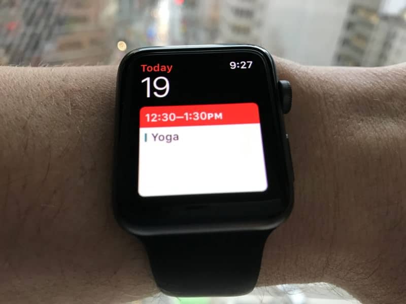
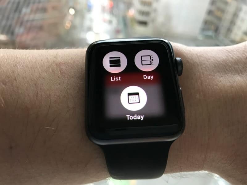
| Calendar | Very well thought out and easy to use. There are 3 calendar views which you can access by pushing down on the screen when in the calendar app.
|
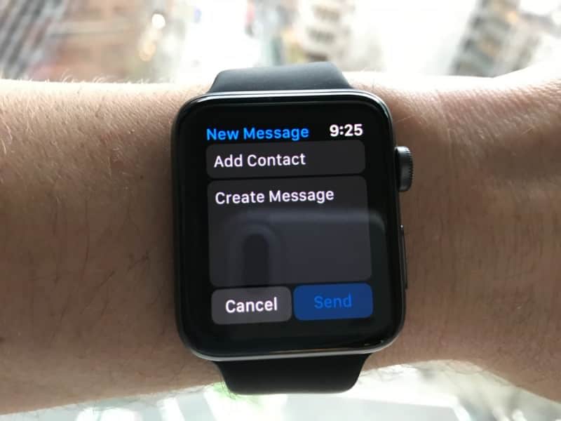
| Messaging | Excellent text messaging interface. Very easy to use and works great with Siri.
|
| Watch Faces | Not many to choose from. I’m not wild about any of them.
|
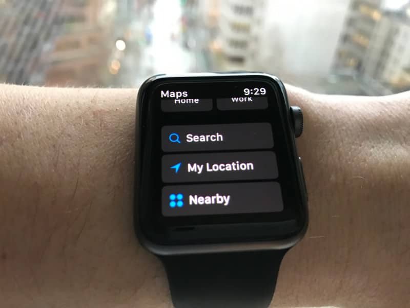
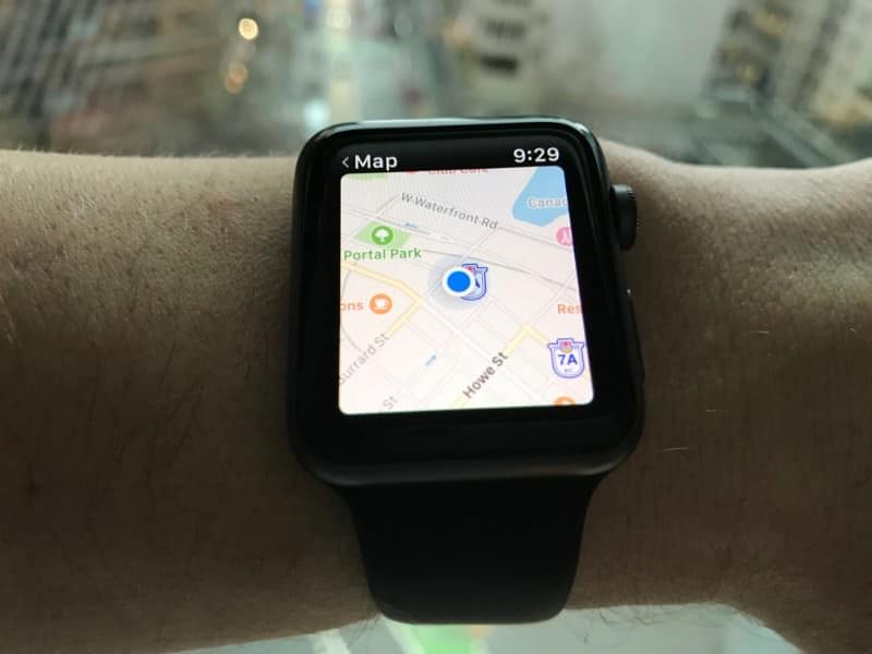
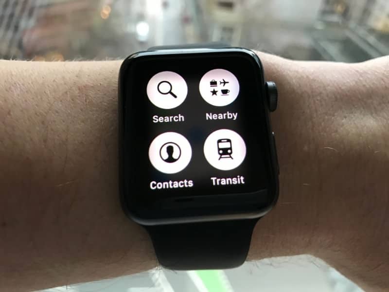
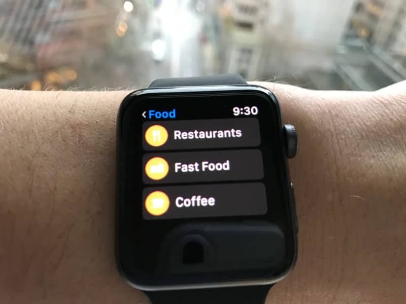
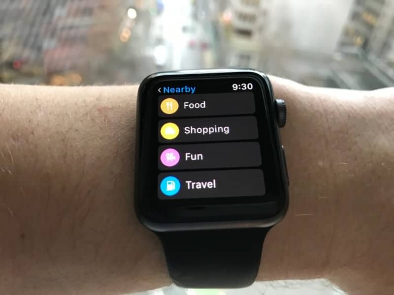
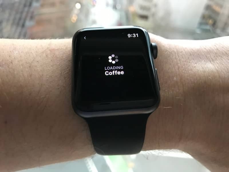
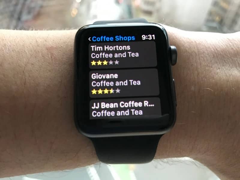
| Maps | Very good app. Loads reasonably fast. Obviously, it’s a small amount of geography that displays but that’s not Apple’s fault; it’s the fact it’s a watch. With the built-in GPS, you can look for all kinds of locations including nearby shopping, restaurants, and more. Very handy.
|
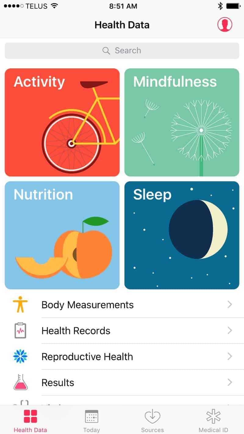
| Health and Activity Apps | I’m impressed with the health app. The amount of health and fitness data you can track is incredible. The user interface is fairly easy to use although it takes a little bit of playing around with it to get familiar with it due to there being so many options. This is one of the most robust health apps I’ve tested especially given you can track pretty much every detail of your nutrition as well as vitals, reproductive health data, and more.
See below in the Health app section for many more screenshots of the health app. |
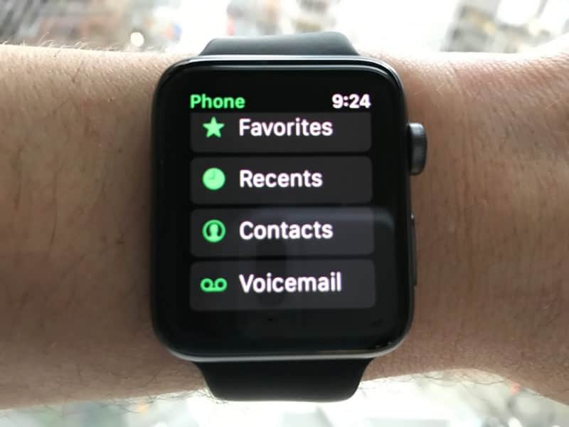
| Phone | Amazing phone quality. I’ve had full conversations with people. Answering is easy. One complaint is you can only call out to contacts; you can’t input a number unless you buy and install the “Watch Keypad” app.
|
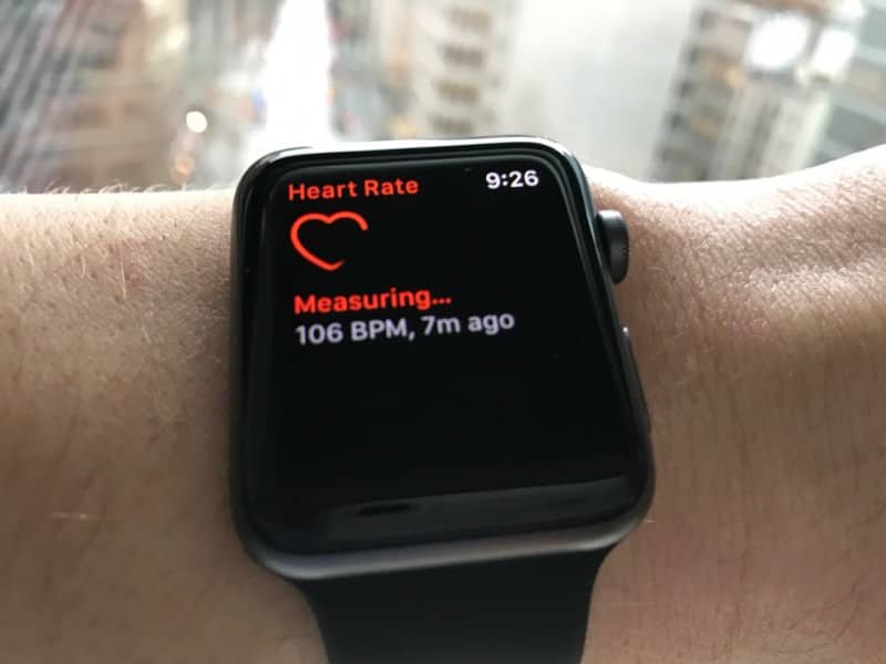
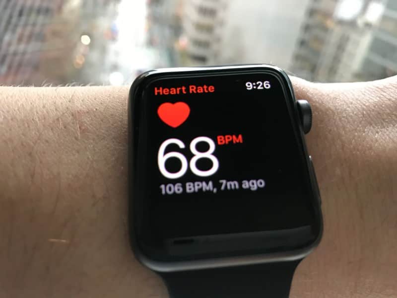
| Heart Rate Monitor | The Apple S2 has the best heart rate monitor of all smartwatches I’ve used with a heart rate monitor. I love how it shows you your heart rate in real-time. Very cool and fairly accurate.
|
| Keyboard Input | Aside from Siri, you must draw letters. Drawing letters is terrible. I’d love a full keypad. I hate to say it, but Android Wear is the king of the keypad; it’s the best. |
| Notifications | I love the vibrations and dings for notifications. Everything is subtle and soft. Moreover, via the watch app on the Apple phone, there are many settings for notifications so you can really fine-tune your notifications on the watch. |
| Music | I don’t use iTunes, which leaves me high-and-dry in the music department. I use Spotify and there’s no Apple watch Spotify app which is unfortunate. I’m sure iTunes works great on the Apple watch, but it sure would be nice if Spotify would work too. |
| Apple Watch App | The Apple Watch app, which controls many aspects of the Apple Watch is excellent. It’s easy to navigate and adjust a wide variety of settings |
Performance
In addition to loving the user interface on the watch, I also LOVE LOVE LOVE performance of the watch with respect to speed, swipe sensitivity, and gesture sensitivity.
Speed
You will not have to wait much when navigating the screens or opening apps. Once in a while, Siri grinds her wheels to carry out your instructions, but other than that, the watch is fast with respect to opening apps, app functioning, and swiping.
Swipe Sensitivity
Overall, swipe sensitivity is good. One problem area is swiping left or right from the home/lock screen. It goes the other watch faces which when swiped often applies that new face. I found this to be annoying. However, within apps, swiping is almost flawless.
Gesture Sensitivity
Hands-down, the Apple gesture sensitivity is the best of all smartwatches I’ve tested (which is a lot). The watch face displays very, very quickly once the watch face is angled sufficiently toward your face. There is no delay unlike Android Wear and Samsung S3 watches.
Waterproof
One feature this watch blows many other smartwatches out of the water is that it’s waterproof; not resistant, but fully waterproof so that you can go swimming, surfing, hot tubbing, and more. This is fabulous.
Video Demo
The Health and Fitness Apps
Apple offers 2 apps for health. One is called “Health”. The other is “Activity”. Both have a very nice user interface but track different information.
The Health App
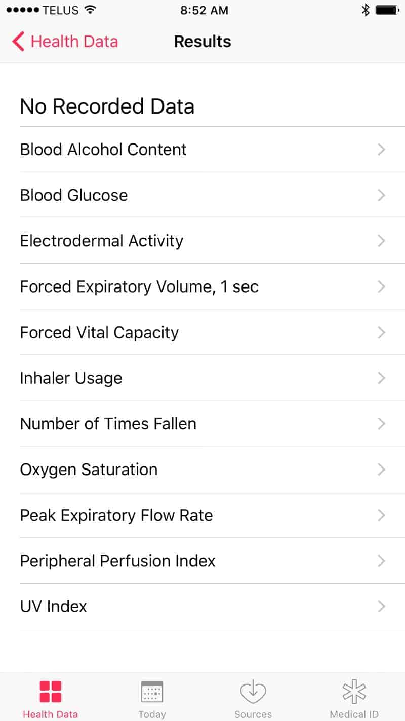
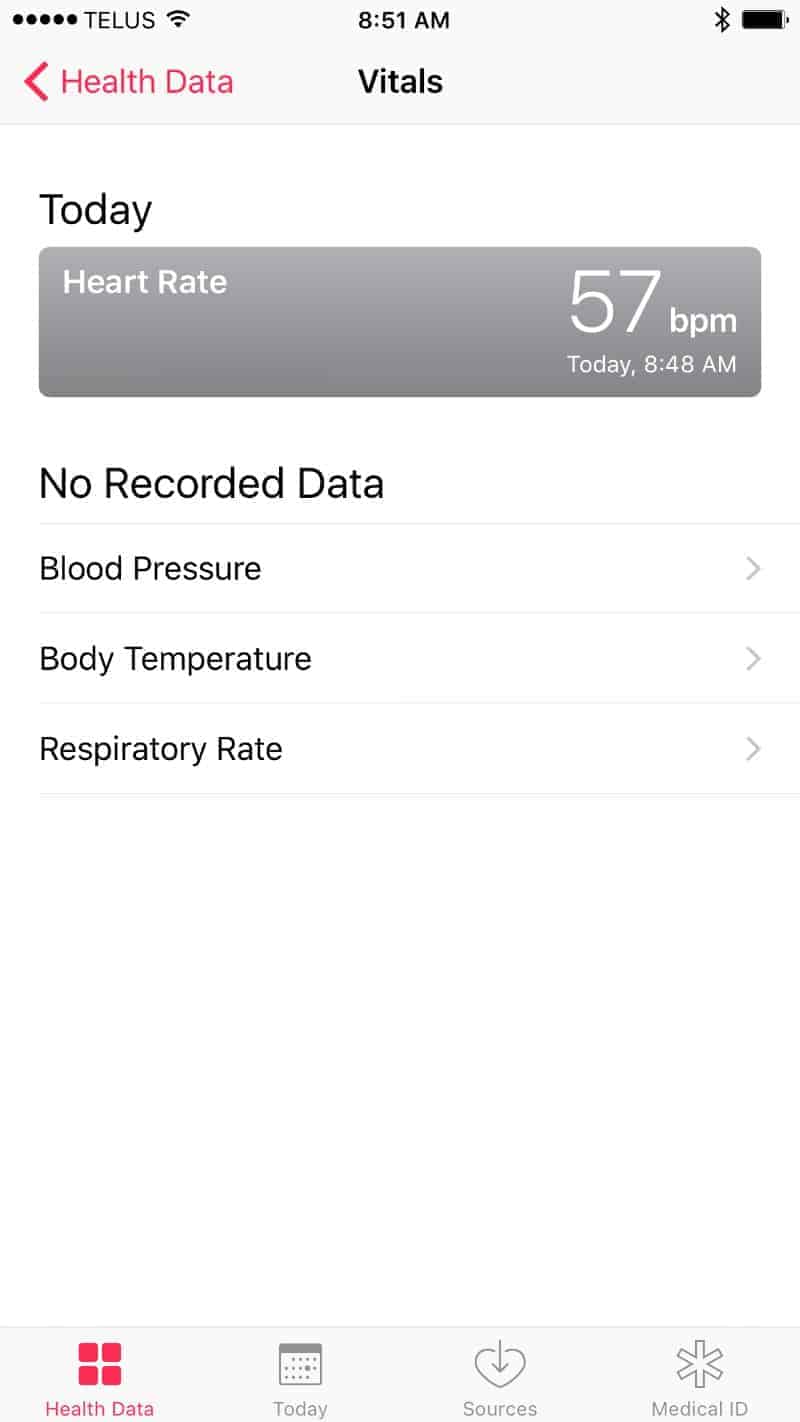
The Health app is where you can track metrics pertaining to general and medical health. The 4 main categories are:
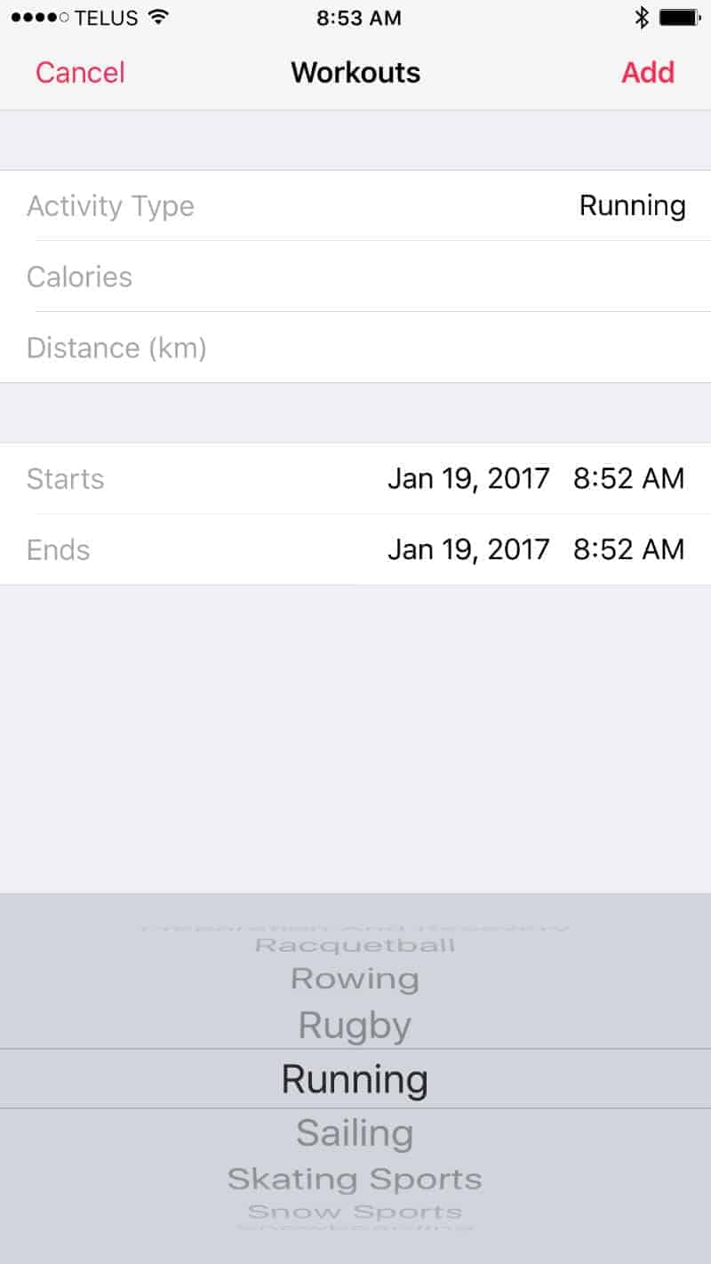
- Activity: This is where you input your fitness activity (that which isn’t automatically tracked such as steps. There are many workouts you can track.
- Mindfulness: You can input your mindfulness sessions.
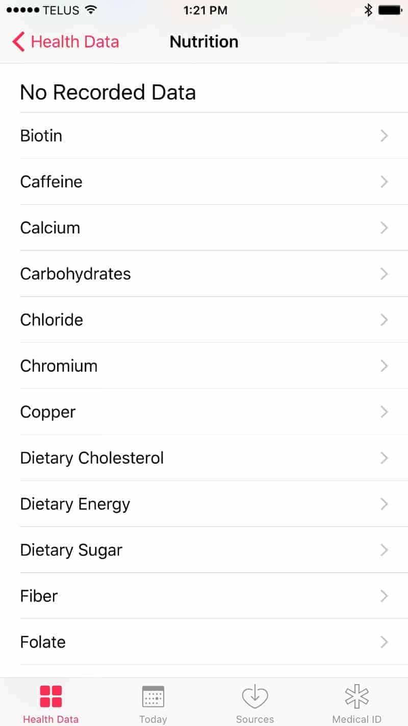
- Nutrition: The nutrition section is insanely detailed. I can see that this would be widely used by people who track what they eat. For instance, bodybuilders carefully track carbs, fat, and protein intake. This app offers the ability to input this data (plus many other metrics such as vitamins and minerals).
- Sleep: You can track your sleep
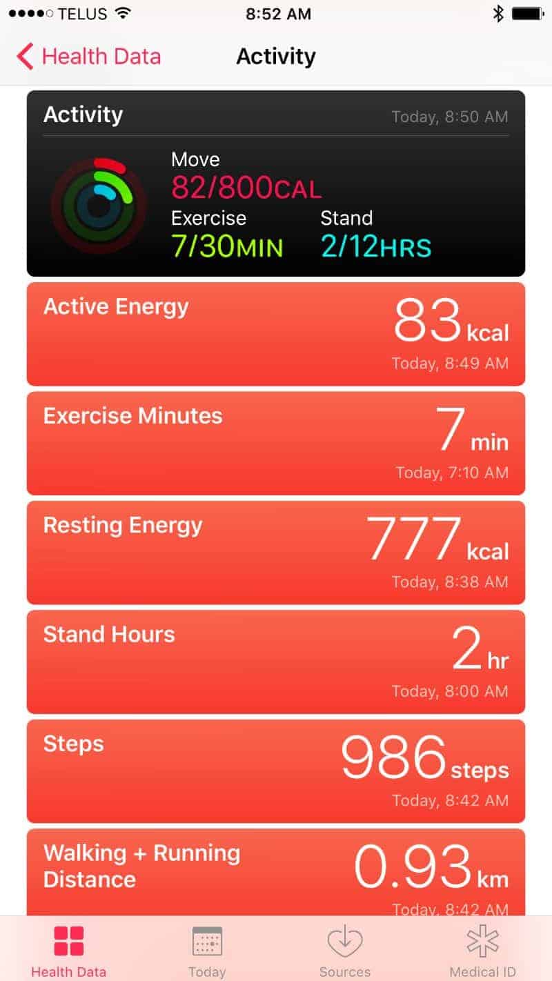
Below are a few screenshots of the Health app illustrating all the info you can input and track.

The Activity App
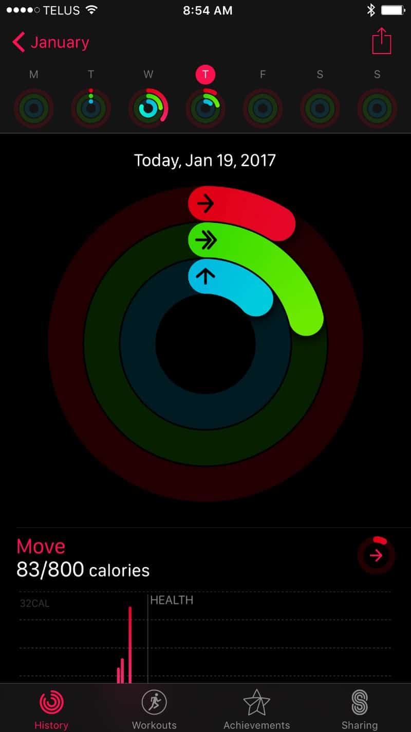
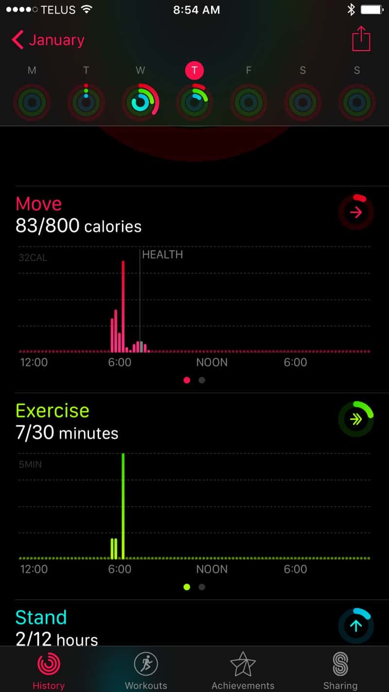
The Activity app presents your data in quite a nice display. It doesn’t do much else other than present data. If you need to input data, use the Health app.
My Top 5 Complaints About the Apple S2
While a good, arguably great smartwatch, there are things I don’t like about it. Here are my top 5 things I don’t like about the Apple S2.
1. Design
The design. It’s not ideally designed for any single purpose. It’s super comfortable for a fitness watch, but the exposed glass makes it vulnerable to getting cracked/chipped. It’s certainly not an elegant design for a formal office or going out. And while it is waterproof and has a pretty cool mapping app for outdoor pursuits, it simply isn’t rugged enough. At the end of the day, the design falls flat.
2. The Charger
The charger isn’t bad, but come on Apple, surely you could have come up with something cooler than a simple magnetic disc that attaches to the back of the watch. This is not the most convenient and stylish charger. Samsung Gear S3 gets it right with a charger… a nice stand to which it’s so easy and fast to attach the watch to it accurately so that it charges. I expect more from Apple who usually puts a great deal of thought into every aspect of design and functionality.
3. No keypad option
I get Apple thinks the world of Siri and wants everyone to use Siri (voice commands) to operate its products. However, sometimes it’s better to use a keypad. One big example is without the keypad, you can’t make outgoing calls to anyone, not in your contacts. I do make calls to places for which I will not add to contacts.
4. No Spotify App
Again, I get Apple wants everyone to use iTunes, but the fact is not everyone who will wear an Apple watch uses iTunes. I for one prefer Spotify. However, there is not Spotify app for Apple and so I’m left high-and-dry with no way to control Spotify from the watch (unlike Samsung Gear S3 watches and Android Wear watches).
5. Battery Life
I’ll say this for Apple and that is they are conservative in their 18-hour battery life per charge reporting. Often, it will last longer unless you use the watch extensively. For example, yesterday, I wore the watch from 6:30 am to 11:15 pm which is nearly 17 hours and I still had a 63% charge, which means at that level of use, it could go another 15 hours easily.
However, the Apple S2 is a premium smartwatch priced higher than many others and therefore it should have a longer life per charge. 3 days at a minimum. Even Samsung Gear S3, which is much cheaper, lasts longer.
What’s the Main Purpose?
I’m confused as to the Apple watch’s main purpose.
Is it a fitness watch?
Is it an everyday “wear to the office” watch?
Both?
If both, it kinda serves both at a mediocre level. The fitness/health app is decent but could be better if a dedicated fitness smartwatch. If everyday you wear a watch, there should be more watch faces and a nicer design. I realize I can buy higher-end versions, but at the end of the day, the rectangle screen in combination with less than stellar watch faces just ain’t gonna cut it as a watch I’d wear most of the time.
Pros and Cons
Pros
- Comfortable: Hardly feels like I’m wearing a watch.
- Siri works well… the most accurate voice recognition software of all smartwatches. This is huge given voice is the easiest way to navigate and input text into a smartwatch.
- Very easy to set up and the Watch app is very good making it easy to add apps, adjust settings… the best watch app I’ve used in terms of ease-of-use and degree of control (high degree of control).
- Fully waterproof.
- Includes GPS and heart rate monitor.
- The Apple Health App is very good… with a detailed medical tracking angle instead of just fitness activity.
- Excellent swipe and gesture sensitivity. It’s also very fast and responsive. A real joy to use.
- Very crisp graphics and glass don’t smudge much at all, unlike many Android Wear smartwatches.
- Outstanding map app with the GPS. You can find local restaurants, transit, shopping and so much more very quickly.
Cons
- Slightly geeky design; not refined. Not as elegant as the TAG Heuer Connected, Samsung Gear S3 Classic, Fossil watches, ASUS ZenWatch 3, Huawei, and others.
- No integration with Spotify.
- Can’t make phone calls to anyone, not contact without paying for the “Watch Keypad” app. Yes, I do need to call people who are not in contact and I bet you do too.
- The watch forces the Apple mail interface instead of the Gmail interface. I’m able to sync my Gmail to the Apple mail, but I much prefer the Gmail interface.
- A limited number of watch faces choosing from.
- Given the price, I expect longer battery life per charge and a better charger.
- Confused purpose: Is this a fitness watch? Everyday watch? I’m not sure. If fitness-focused, I’d expect a better health app. If every day, I’d at the very least like more watch face designs and perhaps a more elegant physical design.
Verdict
Without a doubt, the Apple Watch S2 is a joy to use. It’s fast, sensitive and you can access everything very quickly. It’s the most efficiently designed smartwatch on the market.
Most of the apps perform well although there’s definitely room for improvement.
Siri is a real joy to use; it’s more help than hindrance which is high praise for voice recognition.
It’s incredibly comfortable; I can hardly feel that I’m wearing a watch.
As a smartwatch it’s amazing. Arguably the best on the market (although the Samsung Gear S3 is neck-in-neck).
BUT, with respect to style, I’m not too wild about it. I feel like I’m wearing a video game watch circa 1988 (which was super cool back then BTW). Yes, I know there are some more expensive models than the one I have that does look better, but the rectangle screen just isn’t doing it for me… dial faces look weird and digital faces look out of place outside of the gym.
Should you buy it?
If you’re loyal to Apple, yes, buy it. It’s good enough that you’ll enjoy it even if it’s not your main watch. I do not regret getting mine.
If you want a smartwatch that’s an awesome, high performing smartwatch, get this watch. It’s nearly flawless in performance.
If you want a stylish watch that happens to be a smartwatch, consider a Fossil, a TAG Heuer Connected, Huawei, or even Samsung Gear S3.


